Our designers are passionate to make amazing designs to make your website look modern and up-to-date with the current trends.
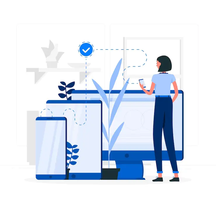
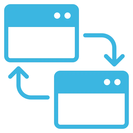
At Veteranlogix, our Responsive Design Service is a testament to our commitment to creating versatile and user-centric digital experiences. In an era where users access websites and applications on an extensive range of devices, from smartphones and tablets to desktops and beyond, responsive design is no longer a luxury but a necessity. Our service revolves around the core principle of adaptability, ensuring that your digital presence remains visually appealing and fully functional, irrespective of the screen size or device used by your audience.
The beauty of responsive design lies in its ability to eliminate the need for separate mobile and desktop versions of a website or application. Instead, a single responsive design intelligently adjusts to the user’s device, providing an optimal layout and usability. This not only streamlines development and maintenance but also enhances search engine visibility, as search engines like Google prioritize mobile-friendly websites in their rankings.
We employ fluid grids and responsive design frameworks to create layouts that adjust to the screen's width, preserving the integrity of your design and content.
Mobile-First Strategy
We often adopt a mobile-first design strategy, ensuring that your content is not just responsive but optimized for smaller screens
Media Queries Implementation
Our expert developers utilize CSS media queries to apply specific styles and layout adjustments based on the user's device characteristics.
Flexible Images
We optimize images to ensure they load quickly and look crisp on all devices. This includes using responsive images, lazy loading, and other techniques to enhance performance.
Content Prioritization
Not all content is equally important on every device. We carefully prioritize content, ensuring that the most critical information is readily available on smaller screens.
Cross-Browser Compatibility
Our designs are thoroughly tested and optimized to work smoothly on various web browsers, ensuring a consistent experience for users regardless of their choice of browser.
These key components of our Responsive Design Service are geared towards providing a seamless and engaging user experience across the diverse landscape of devices, screens, and browsers that your audience may use to access your website or application
Related Work
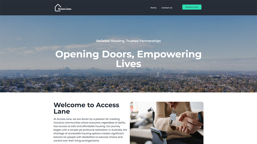
Access Lane
Elementor, UI/UX, WordPress
At Access Lane, we are driven by a passion for creating inclusive communities where everyone, regardless of ability, has access to safe and affordable...
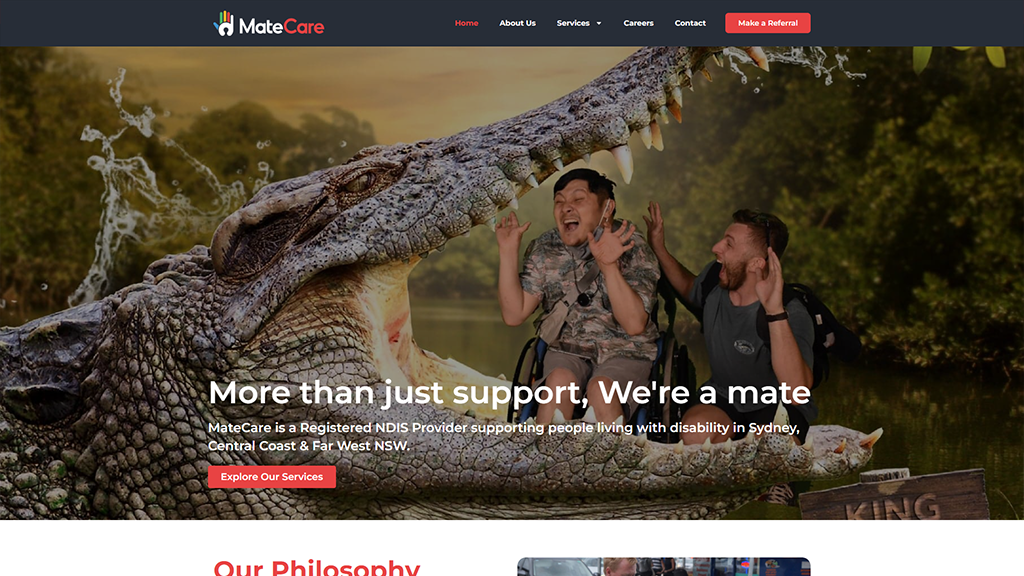
MateCare is a young and vibrant NDIS-approved service provider that was established in 2018. Our team is comprised of highly motivated and professional individuals...
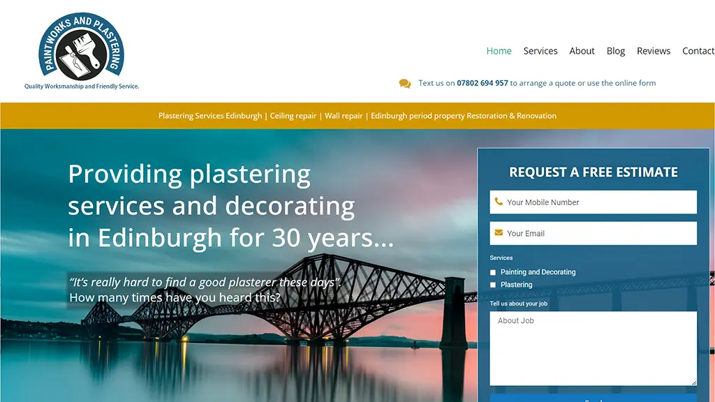
At Paintworks and Plastering Edinburgh we take great pride in dispelling this commonly held belief. We are a well established and highly recommended company...
Established in 2019, CommonWealth Saddles strives to provide saddle fit solutions that are comfortable, ergonomic, and sustainable for horse and rider. Not only does...
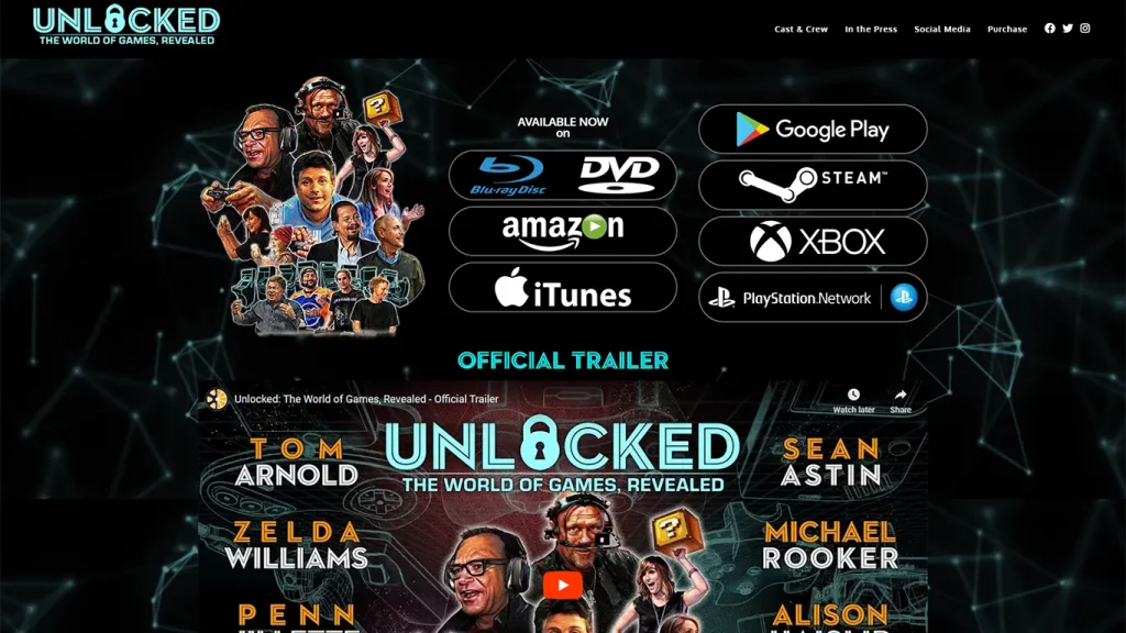
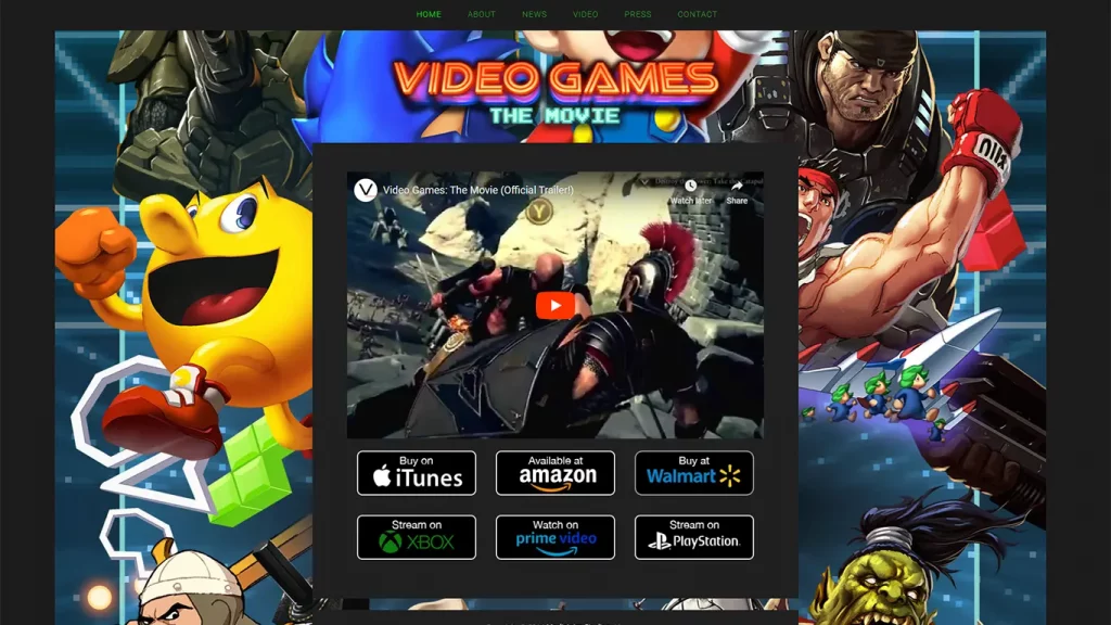
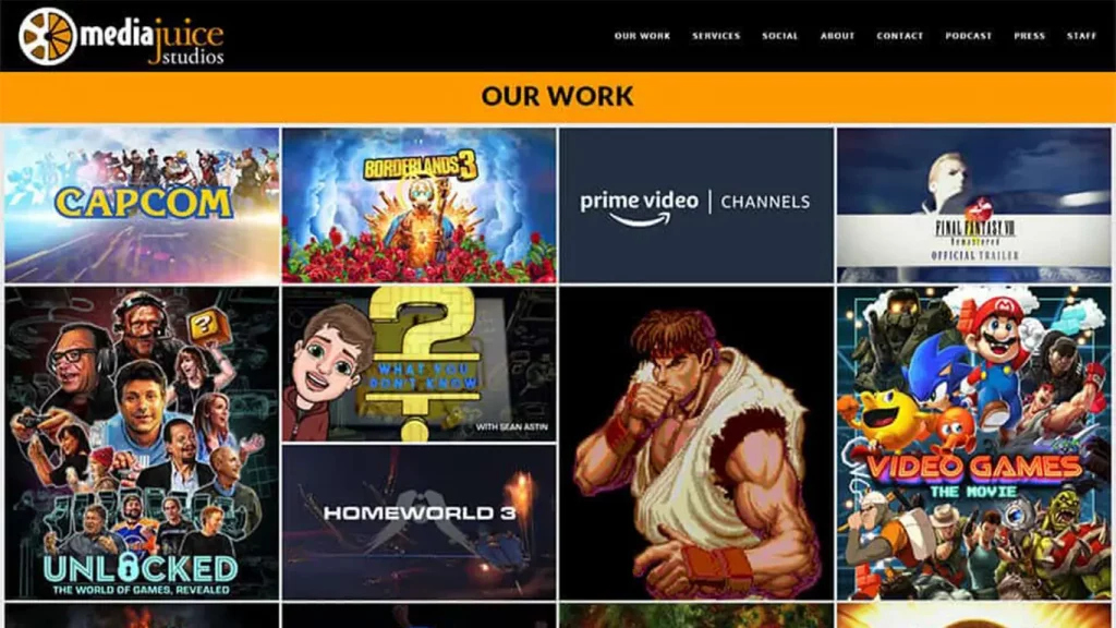
Video Games: The Movie is a feature-length documentary that aims to educate audiences about how video games are made, marketed, and consumed by looking...
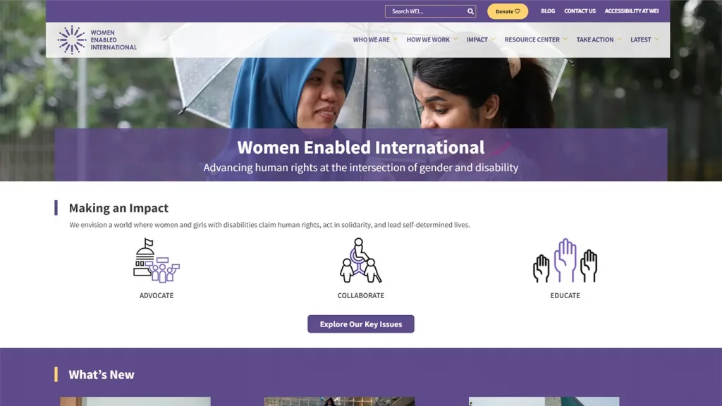
Women Enabled International (WEI) appreciates the opportunity to provide the Committee on the Rights of Persons with Disabilities (CRPD Committee) with information on the...
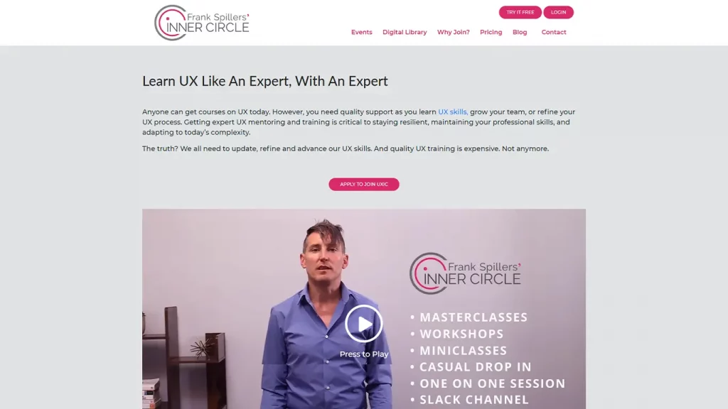
Look out for Frank Spillers’ Inner Circle, a monthly online gathering ($99 per mo.) with hot topic discussions, process tune-ups and case study problems...
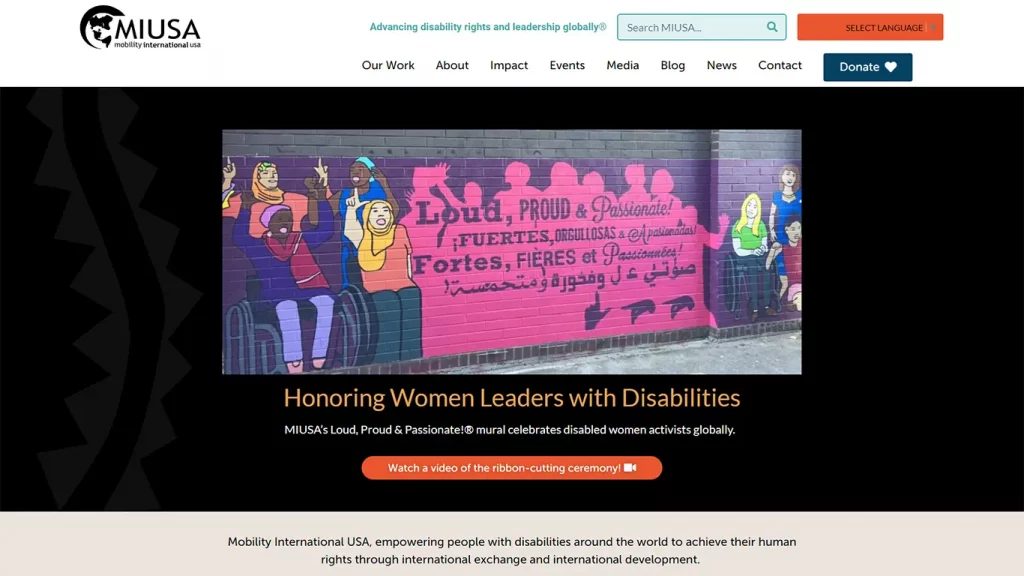
Co-founded in 1981 by Susan Sygall and Barbara Williams, Mobility International USA (MIUSA) is a disability-led non-profit organization headquartered in Eugene, Oregon, USA advancing...
We understand the importance of transparent and flexible pricing options that cater to the diverse needs of our clients. We offer a range of thoughtfully designed pricing packages that provide exceptional value.
Fixed Bid Project
$
250 Per Month
Got a project that has specific requirements which requires a quick turnaround? This plan has you covered.
Dedicated Developers
$
2500 Per Month
Get a dedicated developer to work on your long-term project that has broad or vague requirements.
Maintenance Plan
$
500 Per Month
Keep your websites updated, maintained and have a team ready to provide support on a moment's notice.


